14.1. Overview of the responsive approach
The traditional approach to providing support for mobile devices
has been to create a separate interface, and have the web site check the
user-agent of the device requesting the page to decide which version of
a page to send. But in the last couple of years, the improvement in the
power and sophistication of mobile devices together with wider browser
support for advanced CSS has allowed a new approach to be used -
responsive design.
A responsive web site sends exactly the same pages to all devices - mobile, tablet, laptop and desktop. It is the device itself which decides how to display the page, based on rules and code that is embedded within the page.
The advantages of this approach are:
A responsive web site sends exactly the same pages to all devices - mobile, tablet, laptop and desktop. It is the device itself which decides how to display the page, based on rules and code that is embedded within the page.
The advantages of this approach are:
- Single interface to maintain
- Richer experience - full feature set (since
not using a separate cut-down interface) and same styling and feel as
the main site (because they are essentially the same
site)
- The interface can be tweaked for a variety of devices of various sizes; for example, tablets can use the chunkier touch-enabled navigation menus while still formatting pages for the larger screen space
- Same URLs for mobile and desktop - since all clients get the same page, there are no separate URLs for the mobile site; this has search engine benefits and also benefits customers who sync bookmarks between their desktop and mobile browsers (because the same URL will work from both devices, and give an optimized experience)
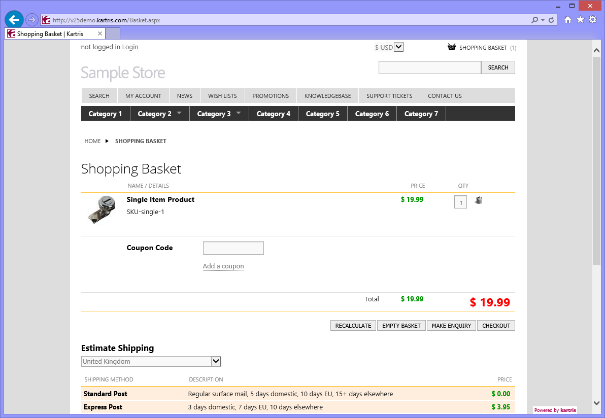
Above: basket page viewed using IE10 on Windows
8 (desktop)
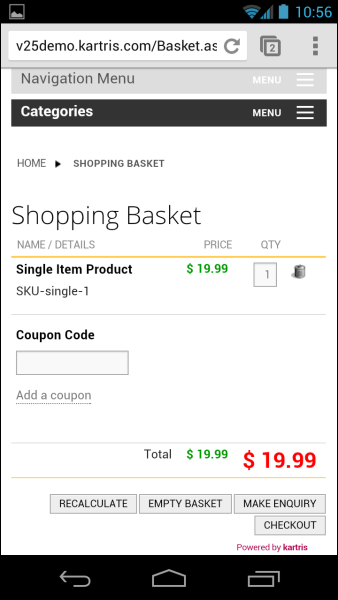
Above: the same page, viewed using Chrome on
Android 4.2 Jelly Bean (mobile)
You can see from the above images that the mobile design is
optimized for the narrower viewing port; the basket images are also
hidden so the important tabular data can fit. The navigation menus
reformat to touch-enabled multi-level dropdown menus.